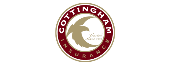
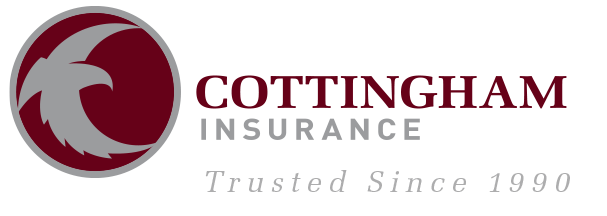
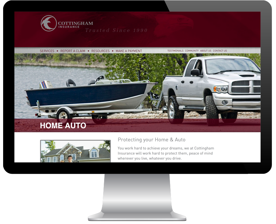
Cottingham Insurance put their trust in Armor to transition the company’s brand from home town to corporate while maintaining the trusted image it is known for. This process started with a slight change of their logo then continued to fresh marketing literature and a new web design.
The goal in transitioning the Cottingham logo from a home town visual to a corporate atmosphere was to maintain the eagle graphic within the circle then execute the wordmark and tagline to accompany the icon. Simplifying the elements to keep them from fighting for attention lets the logo breathe. We kept burgundy as the foundation color then changed out the gold to silver for better contrast, making the transition easier for the current customer.